CLIENT
Jeremy & Sons
CHALLENGE
Jeremy & Sons owner Mike Musung presented the task to create a branding for the café inspired by a 1940s style New York delicatessen. The first venue on Bayswater road kickstarted the initial branding project, and only a few months later a second location opened on Macleay street.
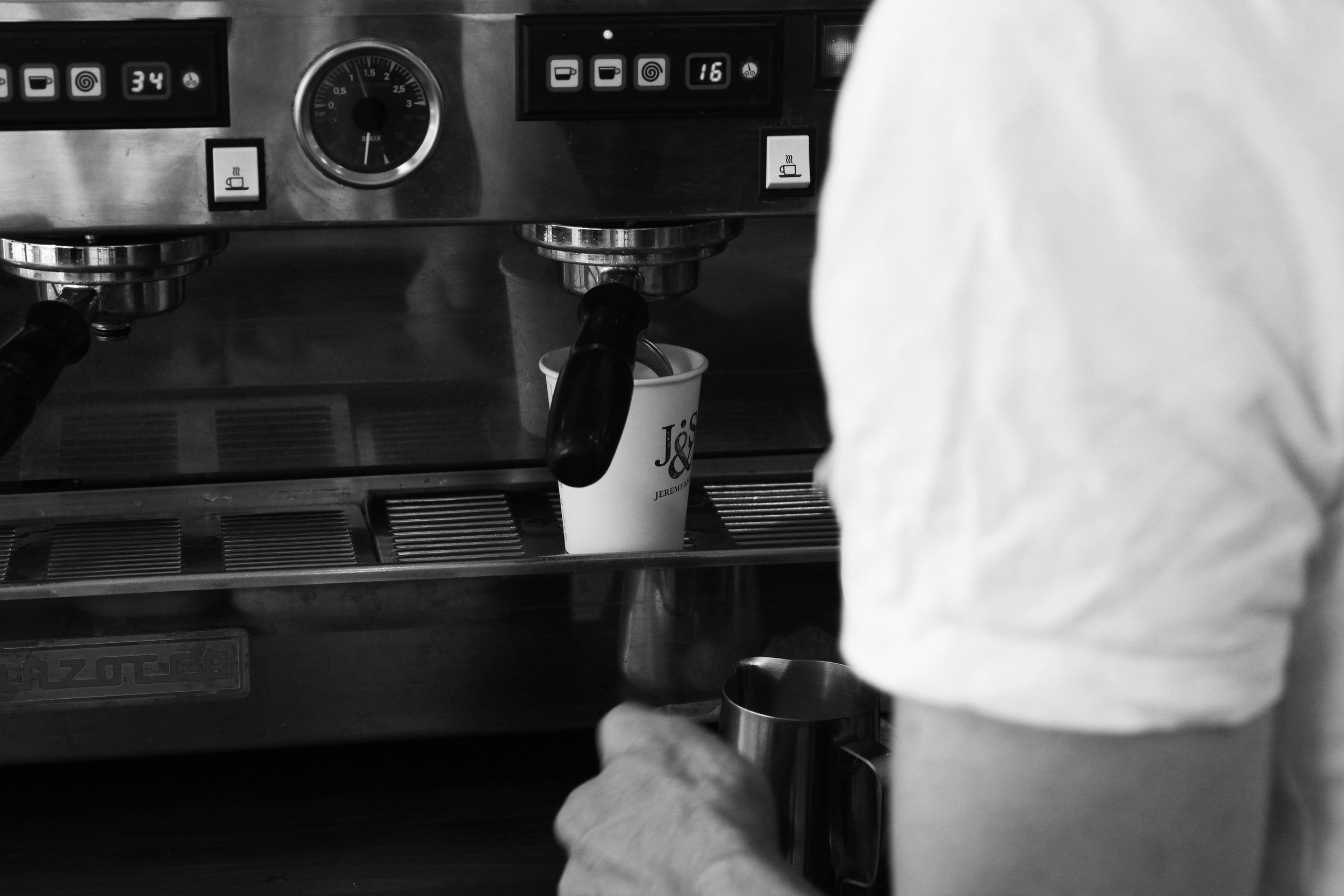
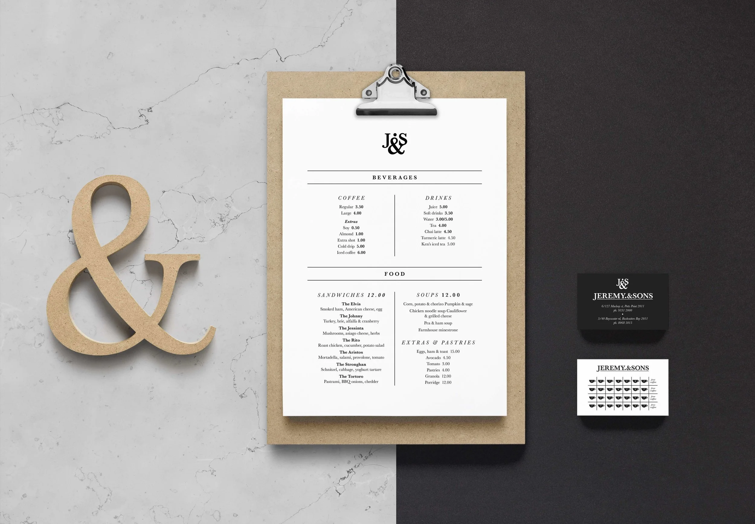
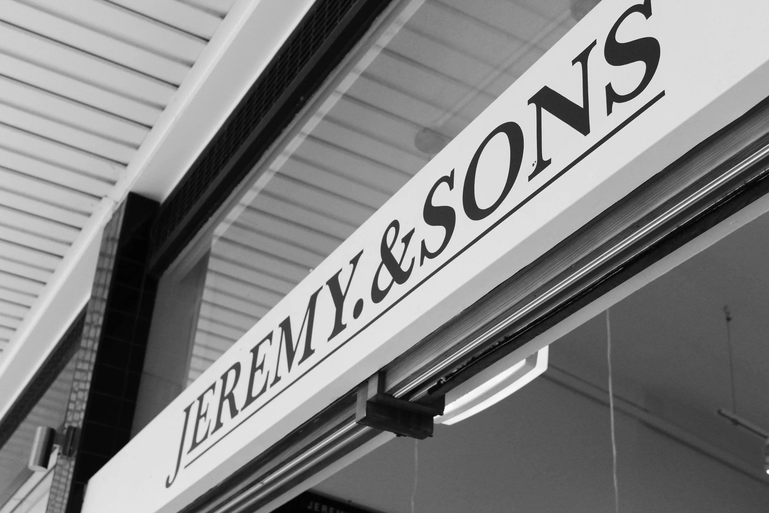
A strong logo-type concept was established using the serif typeface ‘Baskerville’ for the word logo and icon in the form of a monogrammed ‘J&S’. The simple monogram was then used as the main focus of the branding and was utilised in a stamp for paper sandwich bags and coffee cups ect. The front of the first location venue had the word logo professionally sign-written above the front doors in black on a white background. While the second location had the monogram as the dominant feature, sign-written in white on a black background with ‘on Macleay’ beneath. The monochromatic branding is a cohesive identity of minimalism, clean sans-serif type treatments and subtle/spacious finishes.
ROLE
Logo design
Menu & coffee/business cards
Signage


